Hover Box Shadow: This is being used for the "paper type" and other "shop your way" links on https://www.redrivercatalog.com
The box-shadow-hover is used if you just want a hover effect, and the box-shadow is used for the box shadow effect.
.box-shadow {  box-shadow: 0 4px 8px 0 rgba(0, 0, 0, 0.2), 0 6px 20px 0 rgba(0, 0, 0, 0.19); }
.box-shadow-hover:hover {  box-shadow: 0 4px 8px 0 rgba(0, 0, 0, 0.2), 0 6px 20px 0 rgba(0, 0, 0, 0.19); }
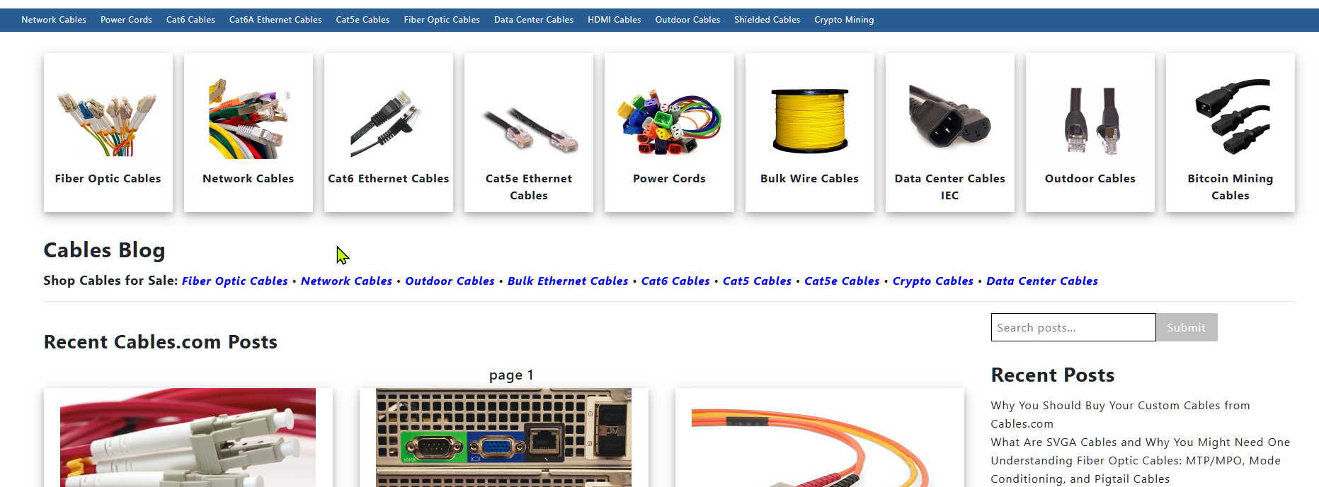
This example is from a site that has nine categories going across the top. Blog post grid has drop shadow so I put drop shadow in for these as well.
https://www.cables.com/cablesblog/page/1/
CSS
<style>

.blog-header-shadow {
	margin-top: 30px;
		margin-bottom: 30px;
	   box-shadow: 0 4px 8px 0 rgba(0, 0, 0, 0.2), 0 6px 20px 0 rgba(0, 0, 0, 0.19);
	   min-height: 225px;
}
.blog-header-title {
	padding-left: 5px;
		padding-right: 5px;
	font-weight: bold;
	margin-top: 15px;
}
.blog-header-img {
	max-width: 150px;
}
</style>
HTML
I used u-grids-9 here because we have 9 elements and without u-grids-9 they drop into two rows. Auto grids are great ways to force odd number of grids into one row.
<div class="o-layout u-hidden u-shown--s u-grids-9" style="display: flex !important;">
<div class="o-layout__item u-text-center">
	<div class="blog-header-shadow">
	<a href=/some-link.html" title="some title">
		   <img class="blog-header-img" loading="lazy" src="/some-image.jpg" alt="some alt text" title="some title">
		   <div class="blog-header-title">some title</div>
	</a>
	</div>
</div>

<mvt:comment>
#
# repeat the above element 8 more times or whatever you need for u-grids-##
#
</mvt:comment>

</div>
https://www.scotsscripts.com/mvblog/drop-shadows-simple-css-for-drop-shadow-elements-in-shadows.html
